the Creative Commons Attribution 4.0 License.
the Creative Commons Attribution 4.0 License.
 | 15 Apr 2024
Renewable Energy Complementarity (RECom) maps – a comprehensive visualisation tool to support spatial diversification
Til Kristian Vrana
Harald G. Svendsen
Maps showing the mean wind speed only give an inaccurate indication of the quality of locations for future wind power developments. Calculating the capacity factor and plotting that on a map gives a better indication of the expected mean power output, but the outcome depends on the turbine choice. In this article, we introduce a general step-by-step method for improved visualisation of potential wind power locations. First, the mentioned dependency on turbine choice is compensated for by putting the expected mean power output in relation to the expected mean power output of all other wind parks of the region. This relative capacity factor results in comprehensive wind resource maps and can be plotted for the situation today and also for a future scenario. Since the expected income of a potential wind park is the product of mean power output and mean market value, looking at the relative capacity factor only does not give the full picture. The mean market value is influenced by the merit order effect that is mainly driven by covariance with other wind parks and the capacity factor's relation to production at low-wind moments. A market value factor is introduced that captures the expected mean market value relative to other wind parks, based on a simplified power market model. Finally the Renewable Energy Complementarity (RECom) index is defined, combining the relative capacity factor and market value factor into a single index, resulting in RECom maps. This map can comprehensively show the revenue potential of different locations for potential future wind power developments.
- Article
(5082 KB) - Full-text XML
- BibTeX
- EndNote


The Energiewende (energy transition), with its shift from fossil-fuel-based electric power sources to weather-driven sources, leads to increasing total variance of the generation fleet's power output (or more correctly the available power output). This variance is problematic for the power system, as it makes the mandatory match between generation and load more complicated (Hodge et al., 2020). There are several means to cope with increasing power production variance, such as electric energy storage or load flexibility from hydrogen electrolysis. These measures can compensate for the variance, and they will be essential for any sustainable power system. However, it is advantageous from a power-system-balancing perspective if total variance can be kept low, reducing the need for such countermeasures and keeping balancing cost lower.
Spatial diversification can help to reduce or limit variance (instead of compensating for it). This approach is gaining increasing importance for the siting of renewable energy sources, and it is an effective countermeasure to limit the increasing variance of the power output from weather-driven renewable energy sources such as wind power (Vrana et al., 2023). It can be imagined as a geographical low-pass filter on the wind resource fluctuations, limiting the impact of local weather phenomena, such as a storm.
The European Green Deal and the European Commission's dedicated offshore renewable energy strategy envision more than 300 GW of offshore wind parks in Europe (European Commission, 2020). A large share of it is co-located in a rather small area: the southern North Sea. The offshore wind power developments in Europe are an example of poor spatial diversification. Such a geographical concentration increases total variance of the wind power generation fleet, with all the negative side effects.
When looking further into the future, it will become important to spread wind power development better in space. This can be driven either politically by strategic selection of wind development areas in a dispersed manner (internationally) or economically by investors who actively seek to avoid co-location with too many existing wind parks for improving potential market revenues. To support this needed spatial diversification, a new comprehensive visualisation tool has been developed: Renewable Energy Complementarity (RECom) maps. The tool is described in this article.
RECom maps combine information about the energy resource at a given location and the expected market value of power capacity installed in this location, resulting in an indicative revenue potential. The cost for wind power developments at these locations (depending e.g. on water depth and distance to shore) is, however, not included; the RECom only addresses revenues, not costs.
Somewhat similar approaches exist that map wind power according to estimated levelised cost of energy (Martinez and Iglesias, 2022; Sørensen et al., 2021). Although highly relevant, such mapping does not capture the fact that wind power impacts the power prices, generally reducing its market value with growing wind power shares (Hirth, 2013). An interesting example of mapping based on market value has been made for photovoltaics (PV) in Switzerland (Dujardin et al., 2022), but there the focus is on altitude effects and not geographical distribution.
We show RECom maps applied to an example of offshore wind power, but the methodology is not wind-power-specific and can likely be used for solar power or for mixes of different weather-driven renewable energy sources.
Here, we have chosen to focus on offshore wind as a single parameter to keep the message clear and because it is a particularly important factor in the North Sea region. Adding more parameters could give a more accurate estimation of future market values but at the cost of introducing more assumptions and uncertainties, obscuring the main message of the article. The main point of the article is to provide a general method for visualising the quality of locations for future wind power development without relying on market modelling. To be useful in this way, it needs to rely on as few assumptions and input parameters as possible. To be clear, such a visualisation tool is certainly not an alternative to detailed energy system modelling and market analysis but a useful supplement for the general discourse surrounding the energy transition.
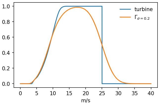
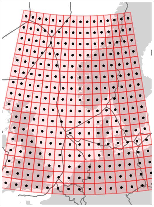
Figure 2Geographical resolution.
This section describes the data used for estimating wind power resources in the North Sea and assumptions regarding future deployment of offshore wind parks.
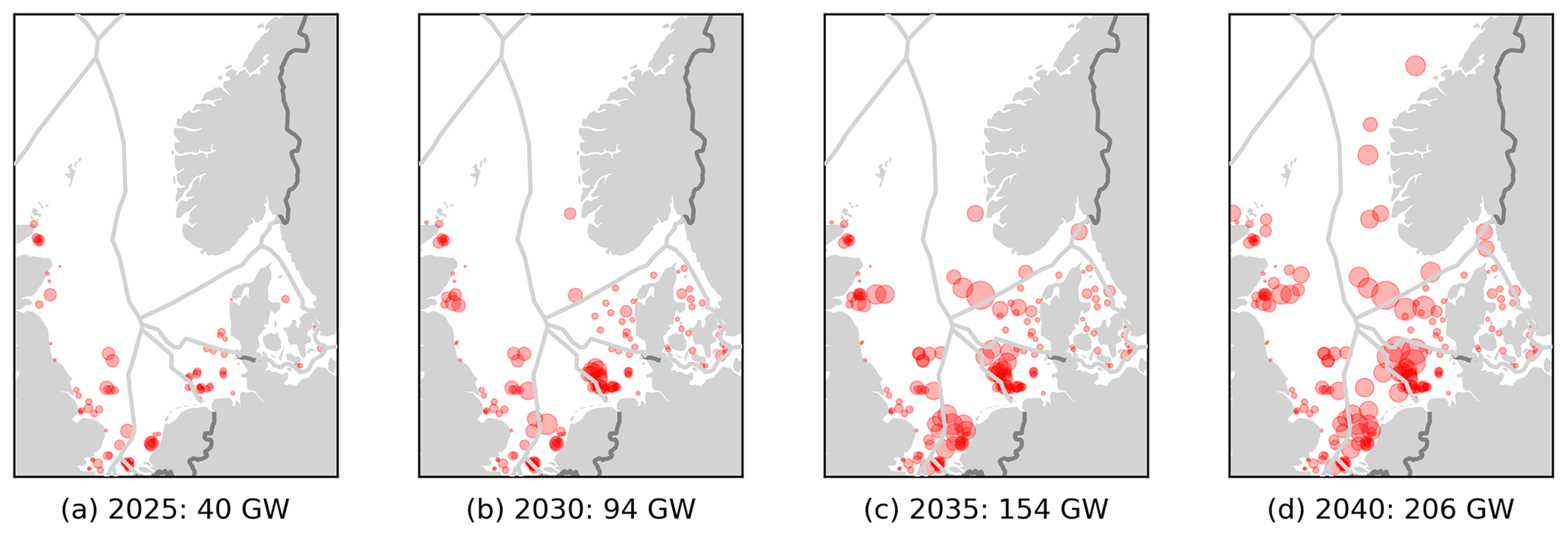
Figure 3Assumed wind power capacity in the North Sea.
2.1 Wind speed time series
To estimate future wind power time series for arbitrary locations in the North Sea area, we use numerical weather model data for historical years. This is a common approach. In our case, we have obtained wind speed data at a 100 m height for the 5-year period from 2018 to 2022 from the MERRA-2 dataset (Molod et al., 2015), using the convenient Renewables.ninja (Pfenninger and Staffell, 2023) interface.
2.2 Wind power
Wind speed time series have been converted to wind power per installed capacity by applying a power curve Γ representative of a large wind park:
This power curve has been obtained by a simple Gaussian filter with standard deviation of σ=0.2 applied to a single wind turbine power curve (Staffell and Green, 2014; Staffell and Pfenninger, 2016); see Fig. 1. This is done automatically by Renewables.ninja.
The Gaussian filtering method to obtain wind park power curves is a simplification that does not include wake effects, and the estimated capacity factors are therefore high. However, for the present study we consider this approach sufficient, especially since this upward bias is compensated for later on (see Sect. 3.3) and because we are considering a future wind power scenario where wake losses comprise only one of many uncertainties.
In reality, a wind park power curve is influenced by several factors (e.g. the choice of the wind turbine type and wind turbine spacing). As these influencing parameters are selected according to the wind resource, the wind park power curve depends on the related wind resource. These considerations are, however, not accounted for in the approach presented here, and for simplicity a single power curve has been used for all cases.
The assumed hub height for wind speeds, the implicit wind shear assumption, the rough geographical resolution and the simple wind power curve are all simplifications/assumptions that create certain biases in the calculations. However, as the final results are concerned with relative comparisons of different locations, uniform biases will tend to drop out and therefore be less important for the maps.
2.3 Geographical resolution
The wind speed and wind power time series were generated for a latitude–longitude lattice at 1.0° intervals in the latitude direction and 1.5° intervals in the longitude direction. This is indicated by the black dots in Fig. 2, using a Lambert equal-area projection. Boxes around these points have been defined for grouping wind power capacity. Only offshore wind power within these boxes is considered in the present study. With this lattice, the data boxes are approximately square at the southern rim of the studied area (50° N). Since longitude lines are closer farther north, the boxes gradually become more rectangular with smaller areas. This does not affect the results in any significant way. Subsequent analyses are all based on this geographical resolution. It is clear from Fig. 2 that the resolution is crude, especially in the coastal areas where the wind changes a lot more in space than far offshore.
2.4 Wind power deployment scenarios
To plot a RECom map, it is necessary to know the main parameters of all wind parks in the considered region. This can be either the real situation, as it is today, or a future scenario, as applied in this article.
Assumptions for the total offshore wind power capacity per country have been based on ENTSO-E Ten-Year Network Development Plan (TYNDP) 2022 “distributed energy” storyline assumptions (ENTSO-E, 2022), except for Norway, where the new target of 30 GW wind capacity by 2040 is considered instead.
The geographical distribution of the wind power capacity has been obtained using public information available via the European Marine Observation and Data Network (EMODnet) (2023) database. This database is a synthesis of national data and includes wind park polygons representing existing and planned wind parks and in most cases their (assumed) power capacity. Wind parks in early planning often lack information about expected power capacity.
Using these data sources, the wind deployment scenarios for 2025, 2030, 2035 and 2040 have been determined according to the following principles (see Fig. 3):
-
In cases where the Emodnet data indicate too high a capacity for a country, wind parks are (randomly) included until the target capacity is reached.
-
In cases where the Emodnet data indicate too low a capacity for a country, the missing capacity is added to planned wind park areas that have an unspecified capacity in the dataset.
-
For 2040, some wind park locations are added manually in line with tentative plans for the various countries (Arup, 2022; Rijkswaterstaat, 2022).
-
Finally, capacity is scaled up or down so that the sum per country matches the country target for the specific year.
-
For 2035, the averages of 2030 and 2040 target capacities were assumed.
The state of the art to assess the suitability of locations for wind power developments is to draw wind speed maps, often called a wind atlases.
3.1 Mean wind speed
It is common to use maps that show the mean wind speed for the goal of assessing good locations for potential new wind parks (Hasager et al., 2006). Such a plot is shown in Fig. 4. This map relies on nothing but the mean wind speeds at a given height (Eq. 2) based on data taken from the sources mentioned in Sect. 2.1.
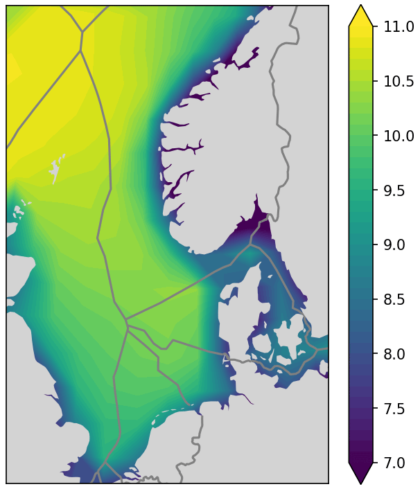
Figure 4Mean wind speed at hub height [m s−1].
3.1.1 Room for improvement
Mean wind speed is indeed a valid indicator for the quality of a site for wind park developments, but it does not give the full picture, as the relationship between wind power and wind speed is highly non-linear. This can be best shown with an unrealistic example:
-
Site A has 6 months of 25 m s−1 and 6 months of 0 m s−1.
-
Site B has 12 months of 12.5 m s−1.
Both sites have identical mean wind speeds and will appear the same on such a mean wind speed map. However, the energy output of a wind park at site A will be significantly lower than for site B. This phenomenon is not accounted for when using mean wind speed maps. It is therefore better to plot capacity factor maps, as explained in the following section.
3.2 Capacity factor
A better indicator of wind power potential is the expected capacity factor , i.e. the mean power output per installed capacity:
In addition to data for wind speeds, this step requires assumptions about the power curve (Sect. 2.2). It gives a better indication of the quality of sites for potential wind parks than the mean wind speed.
3.2.1 Room for improvement
Using the capacity factor is already an improvement compared to the mean wind speed map, as it gives a more accurate indication of the expected energy output of a wind park. However, there is still a problem: the result depends on the power curve Γ(v) used. It is not clear if a capacity factor calculated to a specific value (e.g. 45 %) indicates a good site or a bad site.
-
If a power curve with large rotor is used (low specific power), 45 % might not be very good.
-
For another power curve with a smaller rotor (high specific power), 45 % might actually be quite good.
3.3 Relative capacity factor
We define the relative capacity factor, which compares the expected capacity factor (under given assumptions) to the mean capacity factor for the considered region (under the same assumptions). This manages to correct, to some level, for various biases introduced by the assumptions needed for the computation, regarding not only the choice of power curve but also other factors as mentioned above. Capacity factor maps may change a lot depending on assumptions, whereas relative capacity factor maps change significantly less, adding robustness to the approach. This enables the comparison of various capacity factor maps that might have been plotted with, for example, different individual power curves. The relative capacity factor also needs to be introduced in order to normalise the capacity factor at a value of 1 for the later inclusion of the market value impact.
First, we write the expression for the normalised aggregated wind power output, which is used as the baseline:
W denotes all wind parks and is the total installed capacity, as given by the assumed deployment scenario (Sect. 2.4). Here we consider only offshore wind parks, but this could readily be generalised to include onshore wind parks. Now we define the relative capacity factor as the capacity factor of location i divided by the mean capacity factor of all considered wind parks:
The relative capacity factor has a baseline value of 1. It is a meaningful quantity to plot on a map (see Fig. 5) as a measure of the wind resource, where the outcome is less dependent on the specific choice of the wind turbine, the spacing between wind turbines, details on wake consideration, etc. It simply shows how the wind resource is distributed with a neutral index that is on average equal to 1.
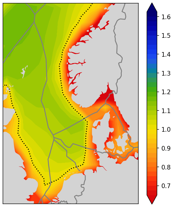
Figure 5Relative capacity factor (2040) – the dotted line indicates a baseline value of 1.
3.3.1 Room for improvement
Even though the shown wind power map nicely indicates how much power can be expected to be harvested at given locations, it lacks an indication of the revenue that can be expected from that generated power. Wind power that is generated simultaneously with many other wind parks will be valued less on the electricity market. It is therefore not enough to only look at the wind resource for identifying good locations for potential new wind parks. It is important to also look at the placement of other wind parks and the covariance between wind parks.
Even though the relative capacity factor map provides a good overview of which location will likely provide a good power output, it does not say anything about which location will provide good revenue on the electricity market.
Due to the merit order effect (Sensfuß et al., 2008; Antweiler and Muesgens, 2021; Ketterer, 2014), it can be expected that wind power output that comes at time when many other wind parks provide high output as well will achieve low value on the market. It can also be expected that wind power output that comes at times when the other wind parks cannot produce electric power will be valued more highly on the market. A suitable mathematical concept to assess these phenomena is the covariance.
4.1 Covariance
The covariance between two time series X and Y is defined as the mean value of the product of their deviation from their respective mean values; i.e.
The variance of a time series X(t) is its covariance with itself, and the standard deviation σX is the square root of the variance; i.e.
The correlation coefficient is the covariance normalised by the standard deviations and will always have values in the interval from −1 to 1:
For the variance of a sum of independent variables, the following general expression holds:
Covariance is a mathematical operation that is very useful for spatial planning of renewable energy. Often correlation coefficients are discussed for such purposes, but that has disadvantages as they only indicate the similarity of the fluctuations of the weather between two locations and no information about the amplitude of the fluctuations. Covariance includes both and is therefore more appropriate for assessing potential sites.
An example is two nuclear power stations giving an almost flat output profile, with tiny but identical fluctuations. Is that correlated? Yes. Is it a problem? No. The tiny fluctuations might be highly correlated, but that does not matter because they are so small. In this case correlation is high, but covariance is low.
4.2 Covariance of normalised power time series
Let us introduce some simplifying notation. We express power time series in terms of capacity and normalised power output, . Furthermore, we write
4.3 Relative covariance
For a candidate new wind park (indicated with the index “i”) and the entire wind power fleet (indicated with the index “total”), we define the relative standard deviation with a baseline value of 1, similarly to the relative capacity factor defined in Eq. (5):
We also define the relative covariance with a baseline value of 1:
The relative covariance consists of two terms. The first term, , is generally larger than zero because aggregation effects lead to a generally lower variability in the entire wind power fleet as compared to individual wind parks. However, there is no mathematical necessity for it to always be larger than 1. At sites with very low wind speeds, values lower than 1 occur. The second term, corri,total, is by definition limited to be at most equal to 1.
The product of these two terms, , can therefore become both larger and smaller than 1. It gives an indication of the quality of a site for potential wind parks with regards to the covariance of the wind power output of that site with the output of the complete wind power fleet.
The relative covariance can be interpreted as the ratio of how much the overall variance increases when adding a new wind park of infinitesimal capacity at a specific location i compared to scaling up total capacity by the same amount. To see this, consider an infinitesimal capacity increase, δp, and the resulting increase in overall variance, δ𝒱. If we add a new wind park i, we obtain
Here, we have suppressed the time dependence, pi=pi(t), ptotal=ptotal(t) and and used Eq. (9).
Similarly, if we scale up existing capacity by the same amount, δp, we obtain
Since δp is infinitesimal, the (δp)2 terms disappear, and we can conclude that the ratio is indeed the relative covariance from Eq. (15):
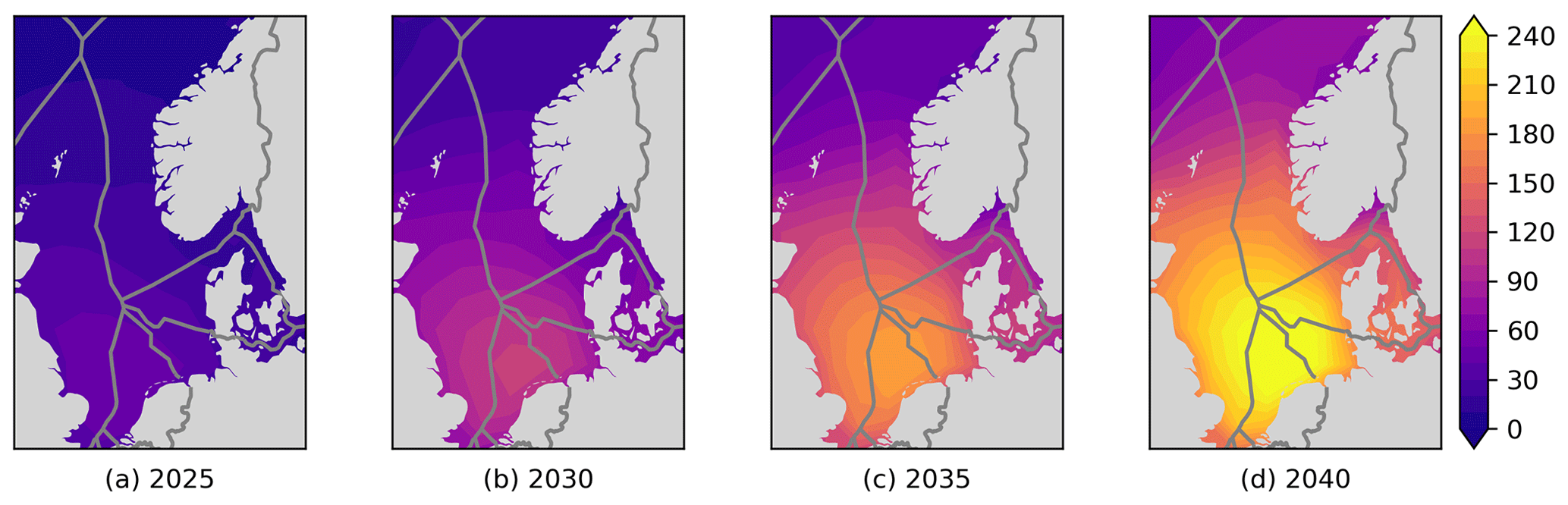
Figure 6Covariance equivalent installed capacities .
Now we can summarise what different values of the relative covariance for a new wind park at location i imply:
-
gives more total variance increase than a flat scale-up of the existing wind power fleet (δ𝒱i>δ𝒱scale), which is the worst case.
-
gives the same total variance increase as scaling up the existing wind power fleet (δ𝒱i=δ𝒱scale), which is the baseline case.
-
gives less total variance increase than a flat scale-up of the existing wind power fleet (), which is good and possibly the best realistic case.
-
does not correlate with the existing wind power fleet and therefore does not influence total variance (δ𝒱i=0).
-
anti-correlates with the existing wind power fleet and reduces total variance (δ𝒱i<0), which is the theoretical best case.
4.4 Covariance equivalent installed capacities
Based on the relative covariance, an expression for the covariance equivalent installed capacity can be formulated:
The covariance equivalent installed capacity has the unit watts (W), which is suitable for understanding and communication. On the contrary, it should be noted that the variance and covariance have the unit watts squared (W2), which is somewhat non-intuitive and difficult to interpret. However, it remains challenging to understand what the covariance equivalent installed capacity exactly means. It can be interpreted in the following way.
The covariance equivalent installed capacity with full correlation with i and the same variance as i has the same covariance with i as the total existing wind power fleet.
The covariance equivalent installed capacity gives an indication of how correlated a potential wind park at location i is with the wind power fleet. It shows how much wind power will fluctuate “synchronised” with the potential new wind park. Even though complicated, it might be perceived as easier to understand than covariance. It can also be used to show how crowded the southern North Sea will become in the future; see Fig. 6. It is a nice way to “compress” all the individual wind parks in Fig. 3, achieving a simpler graphical representation of the influence of the existing wind power fleet.
In Fig. 6, we show the covariance equivalent installed capacity maps for all the four scenario time steps. The plots nicely illustrate how the situation gets worse over time as more wind power capacity is added.
However, the covariance equivalent installed capacities shown do not directly indicate good or bad sites for new wind parks. A value of 50 GW might be bad in 2025, but it is good in 2040, as the levels then are generally much higher.
4.5 Implications for wind power maps
Adding a new wind park in the yellow area of Fig. 6d, which will reach high power output mostly at times when a large part of the North Sea wind power fleet is doing exactly the same, might not be a good idea. Even if the wind resources in that area are good, as shown in Fig. 5, the produced power will likely achieve a reduced value on the electricity market. It is therefore not sufficient to look at relative capacity factors as in Fig. 5 for determining good locations for future wind power developments. Another type of map is needed that accounts for both the wind resource and the complementarity with other wind parks. This is introduced in the following section.
In this section, we develop Renewable Energy Complementarity (RECom) maps, which aims to address the drawbacks for normal wind resource maps and which accounts for covariance with existing wind parks.
5.1 Complementarity factor
Now, based on the relative covariance in Eq. (15), the complementarity factor is defined:
A map displaying the complementarity factor is shown in Fig. 7. The complementarity factor has a baseline value of 1 and contains the same information as the relative covariance , but it is expressed in a format which corresponds well with the relative capacity factor from Eq. (5) (shown in Fig. 5), as it shares the following properties:
-
Higher values indicate better sites.
-
Average sites score a value of 1.
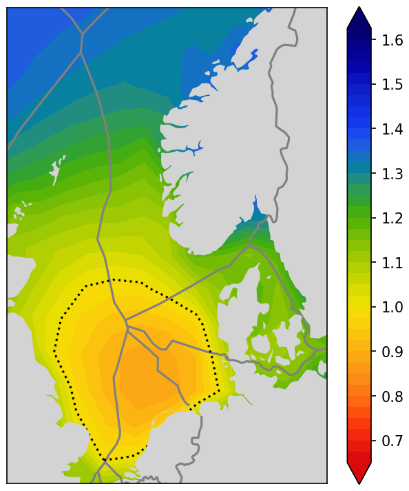
Figure 7Complementarity factor Φi (2040) (β=0.5).
The parameter β is a positive number and represents the weighting of how much higher Φi an uncorrelated production profile achieves compared to a fully correlated production profile. There is no correct quantification of β; it is simply a choice. We chose to operate with β=0.5. The sensitivity towards the choice of β is elaborated on in Sect. 6.4.
The complementarity factor Φi gives an indication of the value of wind power, as it accounts for covariance and the fact that uncorrelated wind power is worth more than correlated wind power. It does however not give the full picture regarding the value of wind power. One central aspect is missing: the fact that higher capacity factors result in higher average wind power values, as the additional energy capture (compared to a site with a low capacity factor) happens during low-wind hours. This additional production is therefore worth more on average than the baseline production during high-wind hours. To capture this relevant phenomenon, the market value factor is introduced.
5.2 Market value factor
Let us try to define a quantity that is an indicator of market value. The obtained income from a wind park depends on the capacity factor and the market price. Wind power has low marginal costs, so more wind power generally means lower prices. For simplicity, let us consider the price y to be a linear function of the total wind power output ptotal(t) with a negative slope:
Here, a bar denotes a mean value. The parameters have been chosen such that at mean wind power, , we get . And if there is no wind power, ptotal(t)=0, we get . So the α parameter indicates how much higher the price is when there is no wind compared to mean wind.
With this assumption, we can compute an expression for the capture price, i.e. the mean value of the electricity price weighted according to energy production. For wind park i, this is
where we have simplified the notation by omitting the time dependence, pi=pi(t), ptotal=ptotal(t) and y=y(t). For the total wind power fleet, we similarly obtain
We define the market value factor as the ratio of these:
Here, and β is a positive number defined through and is given by the characteristics of the power market and the total wind power fleet.
The parameter β represents the expected value increase in an uncorrelated production profile compared to a fully correlated production profile. It corresponds nicely with the parameter β from the complementarity factor Φi in Eq. (22) in the previous subsection. The choice of the parameter β has a significant influence, although there is no correct way to determine it, as the future behaviour of the electric power market depends on many uncertainties. The sensitivity towards the choice of β is elaborated on in Sect. 6.4.
The market value factor has a baseline value of 1. It is similar to the complementary factor Φi but with the difference that the factor is replaced by , a modification that precisely addresses the missing aspect of Φi identified above.
For the data we use in this article, σtotal=0.22, and a value β=0.5 therefore corresponds to α=1.9.
Remember that . From Eq. (26), it can be seen that if , then . If , then decreases for larger values of . This is natural, as more variability correlated with existing variability is bad. In the case of negative correlation , increases for larger values of . In that case, larger variance improves the complementarity. For a “typical” wind park location, ; for bad locations, it will be less than 1, and for good locations, it will be larger than 1.
It should be noted that the calculation of the market value factor is based on a strongly simplified and idealised linear market model, which cannot fully represent the complexity of the power market price-setting mechanisms. It only captures the general trend and cannot include non-linearities of the merit order curve and other relevant phenomena. The influence of the electricity transmission network is not included, leaving out grid congestion and power market price zones that can have significant influence on the revenues. Such simplification was assessed to be necessary to realise a simple index, where the main aspect to capture was the general trend. National legislation can also influence the revenue potential for a wind park (e.g. though support schemes and renewable energy policies), but such phenomena are not accounted for here.
5.3 Exponential extrapolation
To represent the relation between wind power output and electricity market revenue, a simplified linear relation was used; see Eq. (23). This linear assumption is advantageous, as it enables the derivation of comprehensive equations such as Eq. (26). But in contrary to its satisfactory microscopic characteristics, the linear assumption does not have acceptable macroscopic characteristics.
The relative covariance can in theory be any real number, leading to potentially being any real number. Negative values of , however, do not make sense as the value of the ability to harvest energy from the wind cannot become negative. In the worst case, the value can converge towards zero if there is an abundance of available power in the system, resulting in high levels of curtailment.
To assure that the market value factor remains positive for all possible input, it is therefore necessary to select another function (other than linear) with acceptable global behaviour. This function would need the following properties:
-
converges towards zero for large positive input,
-
diverges towards infinity for large negative input,
-
behaves similar to the previously used linear function in the realistic range for wind power data.
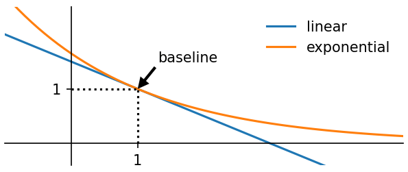
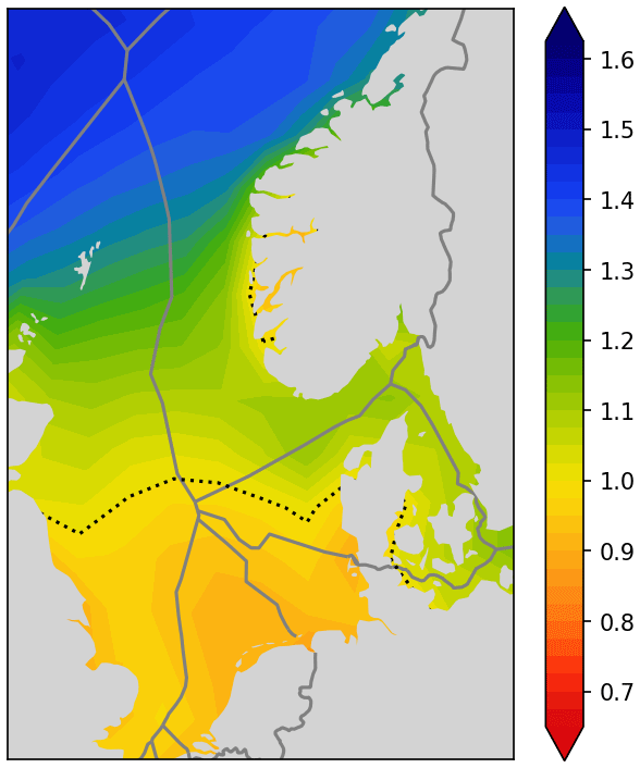
Figure 9Market value factor (2040) (β=0.5).
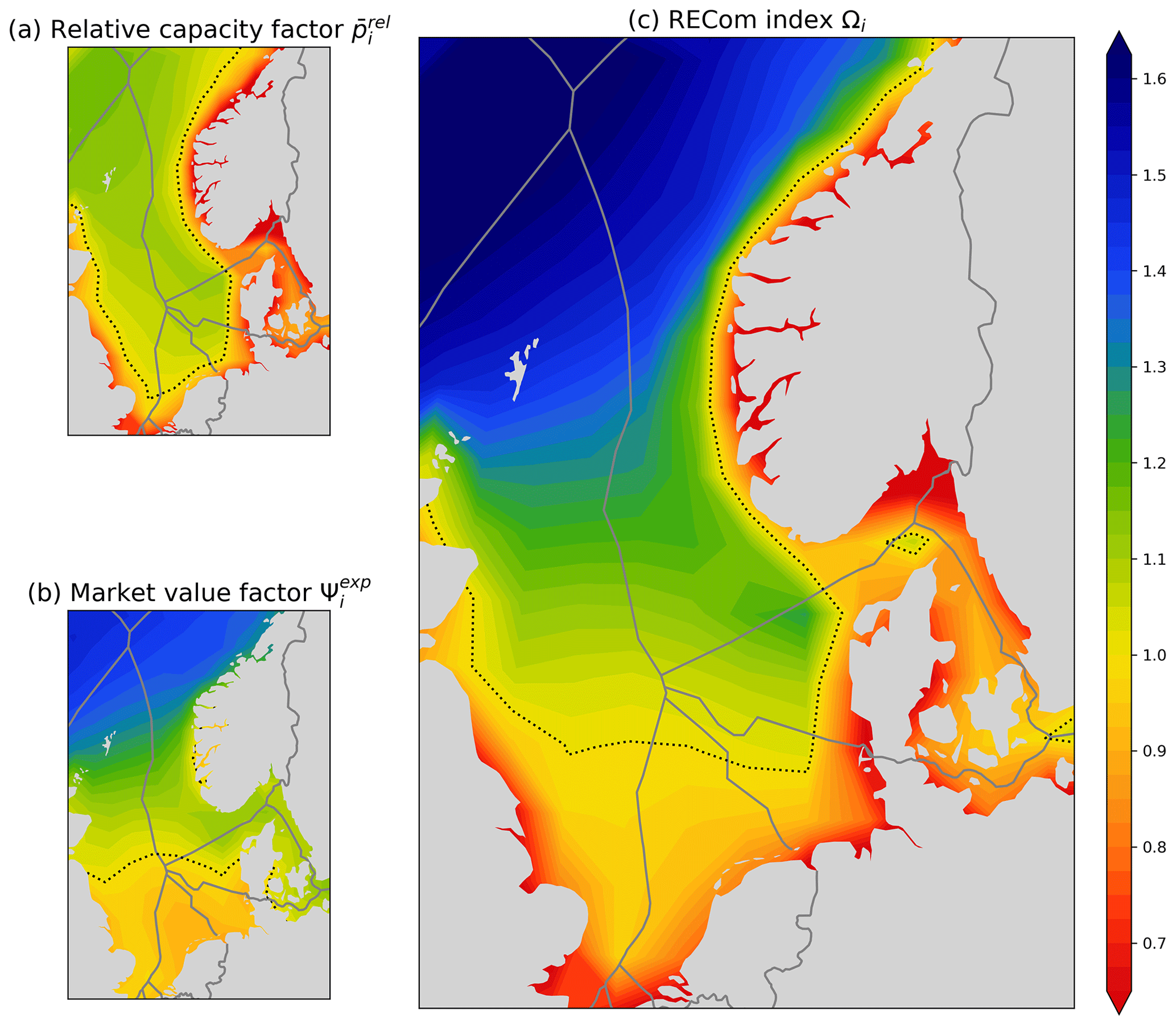
Figure 10Relative capacity factor, market value factor and RECom index (2040) (β=0.5).
Recall that the Taylor expansion of the exponential function is
Equation (26) is therefore the first-order Taylor expansion of the exponential function eβ(1−x) for and a good approximation of it if x≈1. This exponential function has the desired properties, including the same value and same derivative in the baseline point x=1. We therefore introduce the exponential version of the value function:
It behaves similarly at the baseline point but ensures acceptable global behaviour (staying always positive). The relation between the linear function and exponential function is shown in Fig. 8.
The resulting market value factor in its exponential form is plotted in Fig. 9.
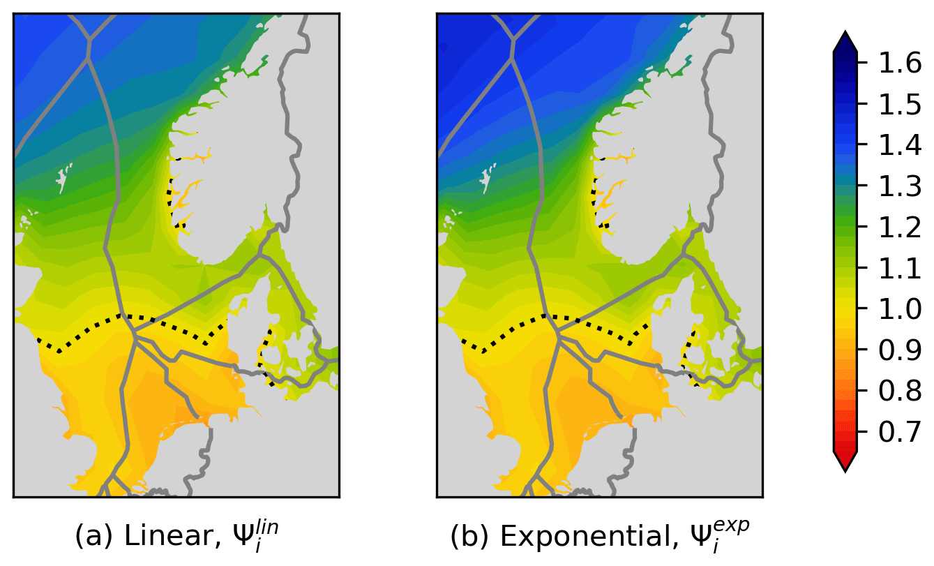
Figure 11Market value factor Ψi (β=0.5).
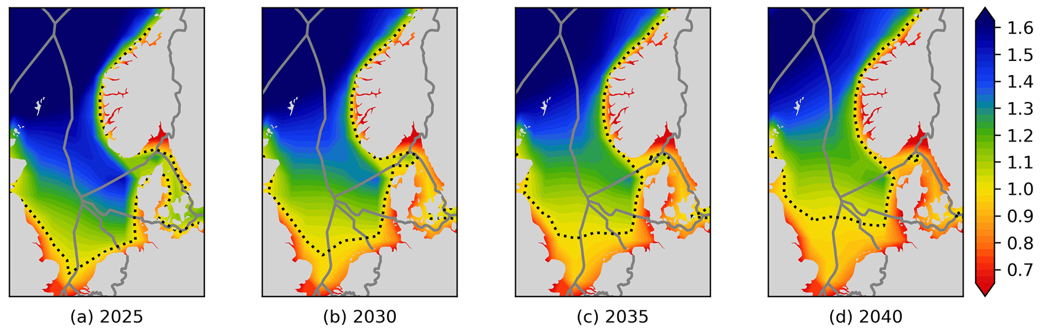
Figure 12RECom index Ωi for different years (β=0.5).
5.4 RECom index
Based on the relative capacity factor and the market value factor , the RECom Ωi index is defined as the following product:
Recall that and .
The RECom index is plotted in Fig. 10. It gives an indication of how good a site is for wind power developments and accounts for
-
the wind resources,
-
the covariance with all other wind parks,
-
the advantage of production in low-wind hours.
An average wind park has an index value of 1. Higher capacity factors result in higher index values. Less covariance with the wind power fleet will also result in higher values.
-
An RECom index larger than 1 indicates good sites.
-
An RECom index smaller than 1 indicates bad sites.
The RECom index is the quantity we have been seeking, and we propose to use this as a basis for maps that visualise the quality of potential wind power sites and the benefits of spatial diversification.
In this section, we discuss the sensitivity of the RECom map towards several influencing parameters.
6.1 Linear vs. exponential
The conversion of the linear value function in Eq. (26) to the exponential value function in Eq. (28) modifies the outcome in the follow way:
-
values larger than 1 (green/blue) are amplified,
-
values lower than 1 (orange/red) are damped.
The influence of the exponential formulation can be concluded from Fig. 8. A comparison is shown in Fig. 11.
As the data considered are rather close to the baseline point (), the influence is limited. The results are therefore not distorted in an unacceptable way by the conversion. It should also be remembered that there is no reason to consider the linear formulation as the correct reference, as the real dependency between power output and capture price is more complex than both the linear and the exponential functions.
6.2 Sensitivity towards the scenario
The RECom index depends for a large part on the scenario and the wind parks considered. It is therefore clear that it will change over time as more and more wind parks are deployed. This development over time is shown in Fig. 12.
It can be observed that the dotted line, which represents Ωi=1 and separates good and bad locations, moves northwards with time. This is due to wind parks in the southern North Sea suffering from increasing covariance equivalent installed capacities, as shown in Fig. 6. It is, however, noticeable that the changes over time in Fig. 12 are significantly smaller than in Fig. 6. This is good as it gives the RECom map some level or robustness when faced with changes in the scenario (which will always be somewhat uncertain regarding the future). It is therefore a good measure for the suitability of sites for potential wind parks in the future.
6.3 Sensitivity towards the sampling rate
Hourly data were used for this study. Figure 13 shows the RECom maps of the same data after resampling to lower resolutions.
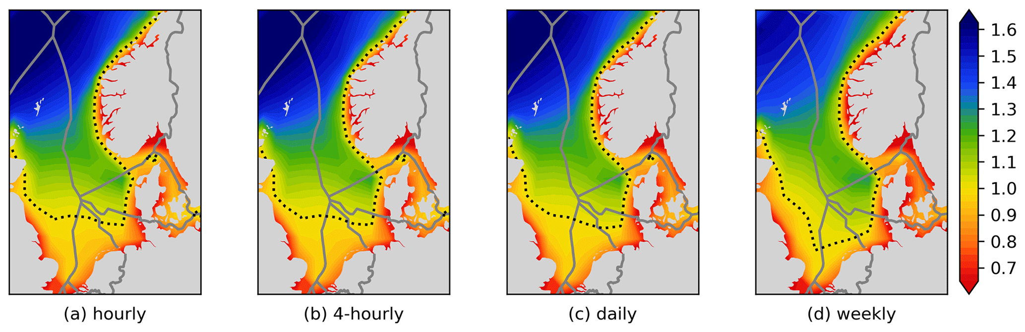
Figure 13RECom index 2040 based on time series with different sampling rates.
Again, we observe good robustness, as the changes are limited. Only in the extreme case of converting to weekly data do significant changes occur. It can be concluded that the performance of the RECom index does not highly depend on high-resolution data.
6.4 Sensitivity towards parameter β
The most influential parameter is β, which represents the dependency of the power price on the aggregated wind power output, as explained in Sect. 5.2. This means that the β parameter can be thought of as a tuning parameter that weights the importance of producing power when other wind parks do not (covariance). Figure 14 shows RECom maps with different values of β.
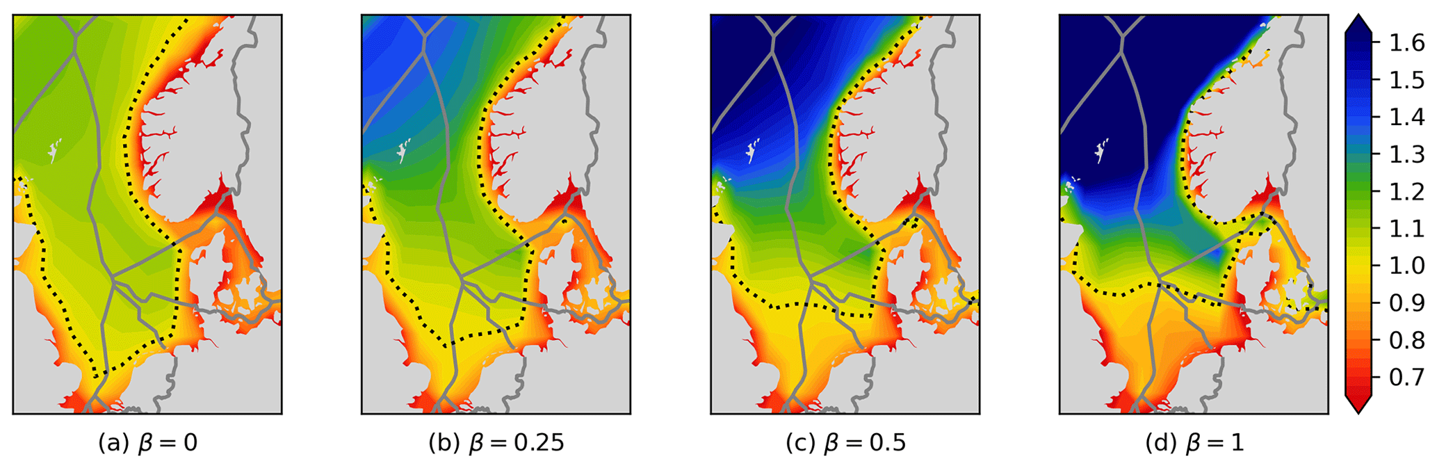
Figure 14RECom index 2040 with different values of the β parameter.
Comparing the different maps shows the following:
-
For β=0, the RECom index becomes the same as the relative capacity factor, , and corresponds to a situation where the value of the wind power from a wind park is independent of wind power elsewhere; i.e. the covariance is considered irrelevant.
-
For large values of β, the RECom index is dominated by the market value factor, and the Ωi=1 line approaches the line as seen in Fig. 9 (for the location of this line is independent of β). This we can see already in Fig. 14d. The values away from the unity line are nevertheless very different.
Our choice of β=0.5 is somewhat arbitrary but gives a situation where the relative capacity factor and the market value factor have a similar range of values around 1.0 and as such represent a similar weighting of those factors in the overall RECom map.
In reality, the most appropriate choice for β depends on the power market situation, which again depends on the scenario year and its assumptions. A better understanding of wind power capture prices in future energy systems would help in choosing a value for β. This could be obtained from detailed energy system modelling and analysis. In general, it can be stated that
-
β increases with increasing shares of weather-driven sources in the energy system,
-
β decreases with increasing load flexibility in the energy system (e.g. hydrogen electrolysis).
It is, however, not within the scope of this article to perform detailed analysis of future energy system scenarios to determine β. The purpose of the RECom maps is to provide a simple way to illustrate wind power value without the need for energy system modelling. Apart from the β parameter, the maps only depend on the wind power deployment scenario without the need for any energy system modelling.
The RECom index and the related RECom maps are useful tools to support spatial diversification by visualising the need and potential for it. They give a comprehensive indication of the expected revenue of potential wind park locations. Compared to the well-known wind resource maps, which display the mean wind speed, RECom maps add significant value, as they include more highly relevant information. Their simple and comprehensive nature is intended to visualise the matter also for people, such as politicians and the general population, who are not familiar with many of the underlying principles.
The RECom index is lower in areas with a lot of wind parks due to the high covariance and resulting lower expected wind power market value. The reality might even exaggerate this, as co-location with other wind parks might depress market value due to not only the merit order effect but also the power output. Areas with a lot of wind parks might be confronted with lower capacity factors (lower than expected) due to wake and blockage effects of nearby wind parks. These wave and blockage effects have, however, not yet been included in the RECom index in its current form.
Even though RECom maps can show a lot more than a mean wind speed map can, one must be careful to be aware of its limitations. A few of these limitations are listed here:
-
The calculation is based on a strongly simplified and idealised linear market model, which cannot fully represent the complexity of the power market price-setting mechanisms.
-
The choice of the parameter β has a significant influence, although there is no correct way to determine it, as the future behaviour of the electric power market depends on many uncertainties.
-
The electricity transmission network is not included, leaving out grid congestion and power market price zones that can have significant influence on revenues.
-
The mean electricity price differs between countries and price zones, and the parameter β might differ as well.
-
National legislation can influence the revenue potential, but renewable energy policies and support schemes are not accounted for here.
It is obvious that a market value estimation based on a very simple model never will show the full picture. However, it is not meaningful to get distracted by comparing the simple RECom index with a complex and time-consuming power market study of a future scenario. Instead, the RECom index and the related RECom maps need to be compared to mean wind speed maps, where the RECom index adds significant value.
RECom maps only show the benefits of having a wind park at a given location and not the cost of establishing a wind park there. For finding suitable locations, cost drivers such as water depth and distance to shore need to be considered as well. These considerations will, to some extent, counteract the benefits of the “good” locations identified by the RECom map, which tend to lay far offshore in deeper waters. This is to be addressed in future work.
Another aspect to be addressed in future work is the conversion of wind data into power output data, which at the moment is performed in a simplified way. It is to be investigated how accuracy can be improved without adding too much complexity to calculation of the RECom index.
The focus of this article is on wind power, but the methodology is not wind-power-specific and can likely be used for solar power. An adaptation of the RECom index for mixes of different weather-driven renewable energy sources will be considered in future work.
The code to download weather model data and create the maps is available on Zenodo: https://doi.org/10.5281/zenodo.10683602 (Svendsen, 2024).
All data used in this study are publicly available and can be obtained together with the code (wind power capacity scenario) or are obtained by running the code (weather model data). Data used for this study are as follows: the MERRA-2 reanalysis dataset obtained via Renewables.ninja, https://www.renewables.ninja/downloads (Pfenninger and Staffell, 2023), and the North Sea wind power capacity scenario, provided as file windfarms_scenario.csv together with the code, https://doi.org/10.5281/zenodo.10683602 (Svendsen, 2024).
TKV had the idea behind this activity and contributed to developing it and writing this article. HGS contributed to developing the activity, realised it in Python and contributed to writing this article.
The contact author has declared that neither of the authors has any competing interests.
Publisher’s note: Copernicus Publications remains neutral with regard to jurisdictional claims made in the text, published maps, institutional affiliations, or any other geographical representation in this paper. While Copernicus Publications makes every effort to include appropriate place names, the final responsibility lies with the authors.
This research has been supported by the Ocean Grid project, which is a Green Platform project financed in part by The Research Council of Norway (grant no. 328750).
This paper was edited by Anca Hansen and reviewed by two anonymous referees.
Antweiler, W. and Muesgens, F.: On the long-term merit order effect of renewable energies, Energ. Econ., 99, 105275, https://doi.org/10.1016/j.eneco.2021.105275, 2021. a
Arup: Future Offshore Wind Scenarios (FOWS) to 2050, https://www.futureoffshorewindscenarios.co.uk/ (last access: 20 February 2024), 2022. a
Dujardin, J., Schillinger, M., Kahl, A., Savelsberg, J., Schlecht, I., and Lordan-Perret, R.: Optimized market value of alpine solar photovoltaic installations, Renew. Energ., 186, 878–888, https://doi.org/10.1016/j.renene.2022.01.016, 2022. a
ENTSO-E: TYNDP 2022 Scenario Report, https://2022.entsos-tyndp-scenarios.eu/ (last access: 20 February 2024), 2022. a
European Commission: An EU Strategy to harness the potential of offshore renewable energy for a climate neutral future, EC Communication, https://eur-lex.europa.eu/legal-content/EN/TXT/PDF/?uri=CELEX:52020DC0741 (last access: 20 February 2024), 2020. a
European Marine Observation and Data Network (EMODnet): Human Activities/Wind Farms, https://emodnet.ec.europa.eu/ (last access: 20 February 2024), 2023. a
Hasager, C. B., Barthelmie, R. J., Christiansen, M. B., Nielsen, M., and Pryor, S. C.: Quantifying offshore wind resources from satellite wind maps: study area the North Sea, Wind Energy, 9, 63–74, https://doi.org/10.1002/we.190, 2006. a
Hirth, L.: The market value of variable renewables: The effect of solar wind power variability on their relative price, Energ. Econ., 38, 218–236, https://doi.org/10.1016/j.eneco.2013.02.004, 2013. a
Hodge, B. S., Jain, H., Brancucci, C., Seo, G., Korpås, M., Kiviluoma, J., Holttinen, H., Smith, J. C., Orths, A., Estanqueiro, A., Söder, L., Flynn, D., Vrana, T. K., Kenyon, R. W., and Kroposki, B.: Addressing technical challenges in 100 % variable inverter-based renewable energy power systems, Wiley Interdisciplinary Reviews: Energy and Environment, 9, e376, https://doi.org/10.1002/wene.376, 2020. a
Ketterer, J. C.: The impact of wind power generation on the electricity price in Germany, Energ. Econ., 44, 270–280, https://doi.org/10.1016/j.eneco.2014.04.003, 2014. a
Martinez, A. and Iglesias, G.: Mapping of the levelised cost of energy for floating offshore wind in the European Atlantic, Renew. Sust. Energ. Rev., 154, 111889, https://doi.org/10.1016/j.rser.2021.111889, 2022. a
Molod, A., Takacs, L., Suarez, M., and Bacmeister, J.: Development of the GEOS-5 atmospheric general circulation model: evolution from MERRA to MERRA2, Geosci. Model Dev., 8, 1339–1356, https://doi.org/10.5194/gmd-8-1339-2015, 2015. a
Pfenninger, S. and Staffell, I.: Hourly wind capacity factors for the EU-28 plus Norway and Switzerland, based on MERRA-2, Renewables.ninja [data set], https://www.renewables.ninja/downloads (last access: 20 February 2024), 2023. a
Rijkswaterstaat: Wind op zee na 2030, https://windopzee.nl/onderwerpen/wind-zee/wanneer-hoeveel/wind-zee-2030-0/ (last access: 20 February 2024), 2022. a
Sensfuß, F., Ragwitz, M., and Genoese, M.: The merit-order effect: A detailed analysis of the price effect of renewable electricity generation on spot market prices in Germany, Energ. Policy, 36, 3086–3094, https://doi.org/10.1016/j.enpol.2008.03.035, 2008. a
Sørensen, J. N., Larsen, G. C., and Cazin-Bourguignon, A.: Production and Cost Assessment of Offshore Wind Power in the North Sea, J. Phys. Conf. Ser., 1934, 012019, https://doi.org/10.1088/1742-6596/1934/1/012019, 2021.
Staffell, I. and Green, R.: How does wind farm performance decline with age?, Renew. Energy, 66, 775–786, https://doi.org/10.1016/j.renene.2013.10.041, 2014. a
Staffell, I. and Pfenninger, S.: Using bias-corrected reanalysis to simulate current and future wind power output, Energy, 114, 1224–1239, https://doi.org/10.1016/j.energy.2016.08.068, 2016. a
Svendsen, H. G.: time-series analysis, Zenodo [data set and code], https://doi.org/10.5281/zenodo.10683602, 2024.
Vrana, T. K., Holttinen, H., Korpås, M., Härtel, P., Couto, A., Koivisto, M., Flynn, D., Lantz, E., Svendsen, H., Estanqueiro, A., and Frew, B.: Improving wind power market value with various aspects of diversification, EEM 2023 Conference, Lappeenranta, Finland, 6–8 June 2023, https://doi.org/10.1109/EEM58374.2023.10161990, 2023. a